The project described in this paper involves monitoring a power plant using PowerBI as a tool for producing reports showing historical data and real-time status.
Tools used
Vcad: visualization of BIM model and use of markers as a representation of each sensor with descriptive tooltip of sensor status.
Power BI: power plant data acquisition and presentation of the data.
InfluxDB: data stream persistence and use of API for acquisition in PowerBi.
Node-Red: generator simulation and data stream management.
Structure of generators
The system consists of wind generators and photovoltaic panels that include a set of read-only sensors.
Wind generators
- Wind speed sensor in m/s. Range 0-20
- Energy produced sensor in kWh. Range 0-5
Photovoltaic panels.
- Vertical tilt sensor (tilt) in degrees. Range 0-90
- Orientation sensor with respect to north in degrees. Range 0-360
Data flow
Data produced by the generators are simulated in NodeRed and sent to InfluxDb.
InfluxDB is an open-source time series database (TSDB) developed by the company InfluxData.
In today’s data-driven world, organizations rely heavily on efficient and scalable databases to store and analyze vast amounts of data. InfluxDB, a time-series database, has emerged as a popular choice for managing time-stamped data, providing fast data ingestion, real-time analytics, and high scalability.
InfluxDb allows querying the database from other platforms. In our case PowerBI uses an API exposed by the InfluxDb server that accepts a flux language query as a parameter. The query allows the retrieval of data in a specific time frame.
It is also possible to filter and group data, e.g., from a single sensor in a specific time frame by averaging the values. In PowerBI the execution of each query produces a table.
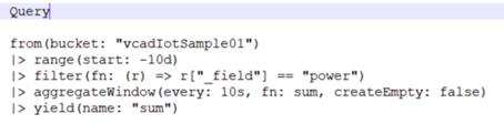
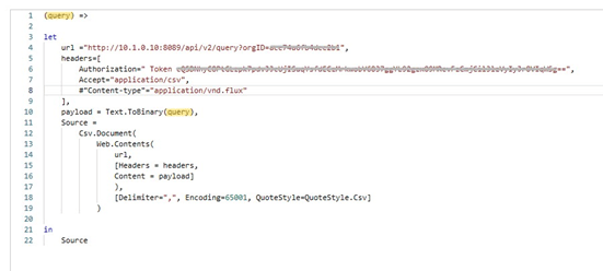 Figure 2 – Call to the InfluxDb API
In our project, two types of queries were developed. The first one retrieves data from ten days prior for historical data analysis. The second query retrieves data from the last minute for real-time analysis. Then, the data obtained is linked to Vcad markers allowing interaction between the viewer and the reports.
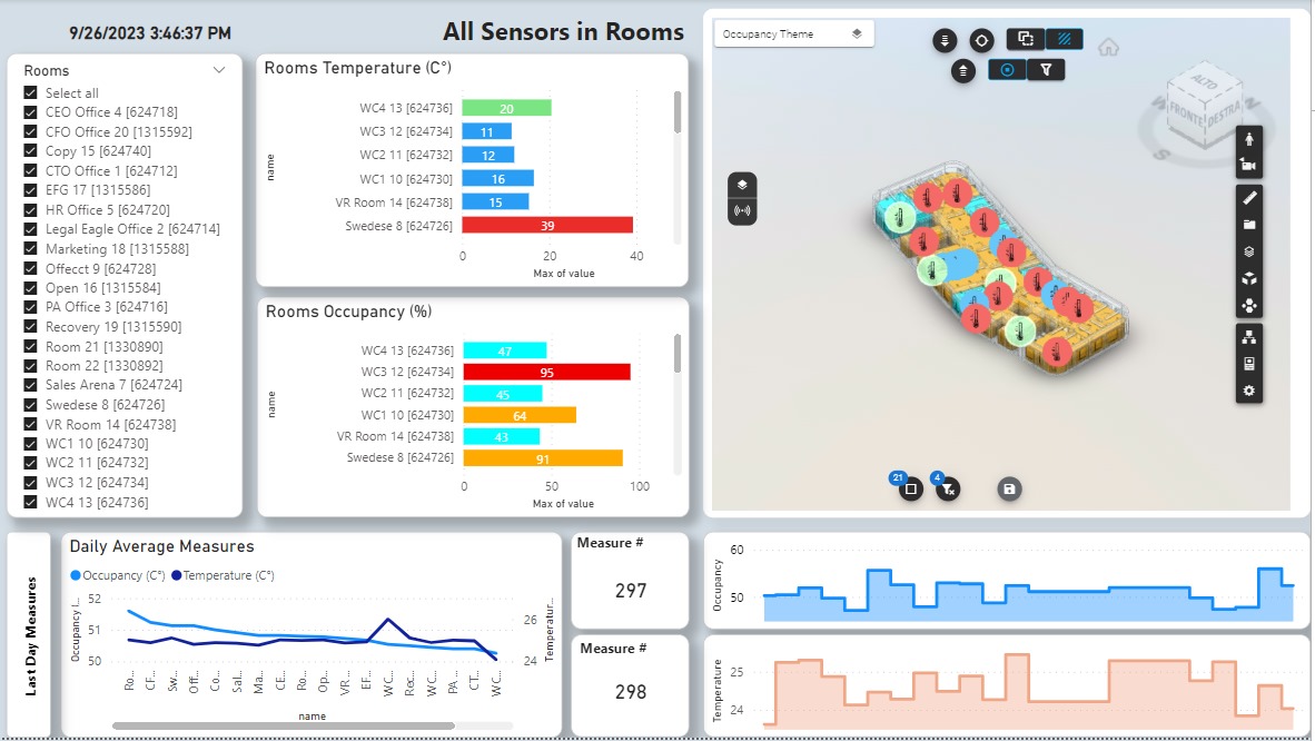
Data retrieved from PowerBi, as described above, produces a report with two pages, one for viewing historical data, the other for viewing real-time data.
Page 1 – Historical energy data
The dataset used by this page queries the data over the last 10 days from InfluxDb. The values are aggregated by summing every 10 seconds. The page displays statistics of energy produced. It consists of the following elements:
Selection table with two columns: name of the sensor, and average value of energy produced in the selected period.
Slicer for period selection: allows the selected period to be narrowed down.
Pie chart: shows the percentage of energy produced by solar panels and wind generators.
Histogram graph: shows the maximum energy produced in the selected period by each generator.
Line graph: shows the trend over time of the energy produced by the two types of generators.
Vcad viewer: allows visualization and interaction with the generators in the context of the power plant. A tooltip on the markers displays two histograms, the first displays the average and maximum energy produced, the other displays physical sensor parameters (average wind speed for wind generators, tilt for solar panels).
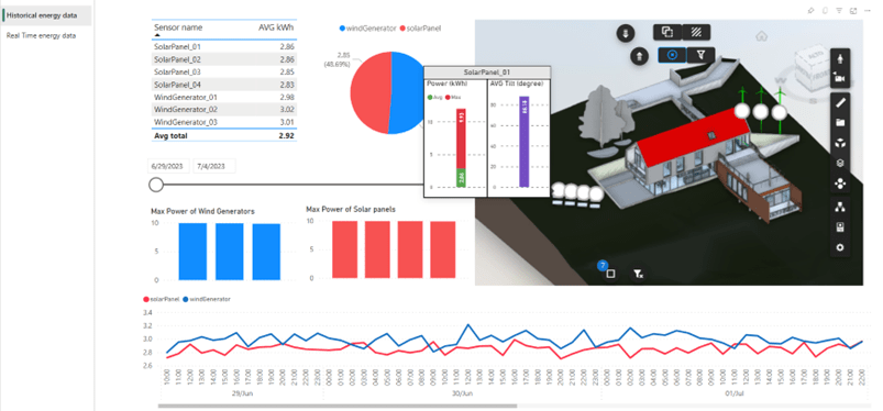
Figure 3 – Historical data report
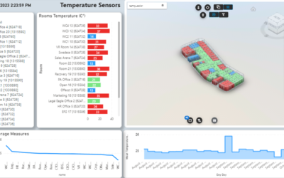
Page 2 – Real Time energy data
The dataset used by this page queries data from InfluxDb over the last minute.
This page displays the real time energy data produced and the history of all sensors in the linear diagram. Unlike the previous page, two gauge-type diagrams are added showing the sum of energy produced in the last minute for wind generators and solar panels. The two histograms in this case display the energy produced by each sensor in real time. Similarly, the tooltips on the markers refer to the values of the last-minute.
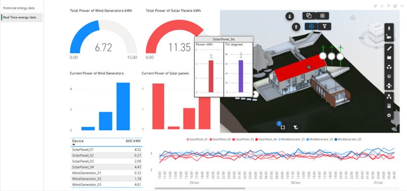 Figure 4 – Real-time data report
Conclusions
This sample highlights the immediacy and ease with which data from sensors can be integrated into Vcad to create effective reports for IoT monitoring.
The combination of InfluxDB and Power BI is particularly valuable for industries such as manufacturing, IoT, finance, and logistics, where real-time monitoring and analysis are essential. It enables organizations to detect anomalies, identify trends, and take proactive measures, resulting in improved operational efficiency and faster response times.
Integrating InfluxDB with Power BI offers a powerful solution for real-time data analysis, empowering organizations to gain valuable insights and make informed decisions promptly.